Saturday, 11 December 2010

Evaluation

1) In what ways does your media product use, develop or challenge forms and conventions of real media products?

After analysing and researching on the horror genre, i was able to understand the conventions used within the genre, helping me to create a film trailer, poster and magazine cover. By following the conventions of the genre of horror i feel it has allowed me to create a successful horror trailer. Our trailers music follows the conventions as it slowly builds up and then becomes faster paced heightening the tension of the storyline. This is typical of a horror trailer as the music connotes what is happening as you watch it, when the music becomes louder and faster, the audience knows that this is what the film has been building up to. The editing of our trailer also saw us sticking to the conventions, the trailer has slow editing to begin with fitting with the music, and when we wanted to speed up the editing, we made the music faster to make the audience tense and excited. This all builds up to the climax of the trailer with out giving to much away to the audience making them anxious to see what happens, which i found to be very typical of this genre. Like many horror trailers we have used captions and dialogue in our trailer, we feel that by having done this the audience can be guided to further understand the concept of our storyline and also see exclusive footage with the protagonists speaking. The magazine cover has one main image of from our film with the characters and locations used. Having analysed movie magazines it is very typical of them to use one main image as the background and it stands out of the cover and tells the audience that this is the next big film to see. This draws in the desired target audience and lets them know what film is exclusively featured in this particular issue. We have also included other interesting cover lines on the magazine cover we also achieves drawing in the target audience. Similar to our magazine, we used one large image for our promotional poster, i found this very typical of film posters. As the poster is there to advertise the film it seems obvious just to have the image of the film you our promoting and therefore becomes the main focus. The title of the film is at the top of the poster so the audience instantly know what film they are looking at, comments and the release date of the film are displayed at the bottom which is generally the main style of film posters. We have also used the same font for the film name on the poster as we have in the trailer, this gives our promotional package a house style and the audience will recognise it.

2) How effective is the combination of your main product and ancillary texts?

We used the same text,colour and font size for the in the trailer the poster of the name of the film. We have also used a constant colour theme with all of texts on all three pieces of our promotional package, this is red, white and black. These colours are all related to the horror genre. We also featured footage from our trailer in the photos, all of these features help the audience to make links with the trailer and this is important as it will keep our trailer in their minds. Also by having similar feature on all the final 3 products it broadens our trailer to a wider audience as they will recognise these features.


3) What have you learned from your audience feedback?

After showing our film trailer, poster and magazine cover to our target audience, they gave our group some feedback with their opinion on what worked and what didn't. A vital element in creating a horror trailer is getting the genre across to the audience, we did not get questioned on the genre and our target audience could instantly recognise the genre by the music, captions, footage, clothing, make-up e.t.c. Also the dark lighting in the trailer reinforces the idea that it is a trailer of a horror genre. Many of our target audience members that we asked commented that they liked the shots used in our trailer as well as commenting on the good acting skills. It was vital that our characters were believable and that the male character (Jon) was obsessed with the female character (Grace) and this came across to our audience which we were please with. We were told that the music was good as it builds up rather than just the same pace throughout. We learnt that by including captions as it helped then gain an idea of the story with out giving to much away, also we had some slight negative feedback about the fonts on the cover of the film magazine, we've taken these comments into consideration and have changed the fonts to a better suited style for our audience members. We had excellent comments for our film poster and how we used the lighting and shot angle, this told our group that no changes needed to be made to the trailer or film poster.

4) How did you use media technologies in the construction and research, planning and evaluation stages?

I have used various media technologies in the construction and research, planning and evaluation fr my A2 coursework. For my research and planning I used numerous websites such as YouTube to find harrow film trailers to analyse. By using YouTube it was easy to upload them to the website blogger (other media technology) using the embed code which i copied into a post, so the trailer i was analysing could be viewed by other people. By analysing current horror trailers it gave me an idea of the typical conventions used. I have used YouTube previously and so it was very easy to use and helpful to add our final horror trailer onto my blog. I also used the apple website to find current film posters which i could analyse and again further my knowledge in the horror genre for film posters, which was very helpful when planning our film poster. I used Google to find images of film Magazine posters which was similar to the apple site, where i gained knowledge of the genre. Both these sites were very easy to use as i have used them many times before.


For the construction of our film trailer our group used a tripod, video camera and lighting equipment which were provided my the school. We had a lesson on how to use the equipment to the best of its ability, our group were fairly experienced with the camera and once we had a play the tri pods we knew what angles we could produce from it. We also used mac computers to edit our footage once we had uploaded it. We used our our cameras to take the pro mo pictures for the poster and magazine cover, as we knew how to use the camera this was fairly straight forward. To edit our footage we used premier pro, our group had no experience in using the software, although we had a lesson on how to use it I found it a difficult piece of software to use in the beginning, however after a few lessons editing i began to learn how to use it and eventually my skills using the programme developed well. Similar to my AS coursework I used Adobe photo shop to create the poster and magazine cover, as i had previously used this, it was easy to pick up how to use the software again. All of the planning our group did has been logged on blogger.com, rather than using folders all of my coursework is put online, this is useful as if a mistake is made it can be changed quickly whereas if a piece of work is handwritten you have to write the whole thing again. Also it fits in with media as the Internet is the future.

Friday, 10 December 2010

Changes due to audience feedback

Final Magazine Cover


Conforming to the conventions of a typical magazine, we have included on the cover: A Masthead, A bar code, A strap line, A pug, Date of Issue and the magazine website. This making the magazine cover look believable to an audience. After our audience feedback we changed the font style on our front cover, we felt that this style looked much better on the cover of a film magazine. Also the red effect around the edge gives it a horror feel. We have know completed out magazine cover, which features are two main characters which is common in advertising a new film. The woods location and expressions on the characters face indicates that it is a film of a horror genre. The main cover lines are featured on the left hand third, this is due to the display of shelving in shops and will be the most visible to the target audience, therefore these cover lines must interest the reader. After our audience feedback about the text not suiting the magazine we decided to adapt this, we added inner and outer glow effects. This is also a much bolder and bigger font making it stand out on the shelves, it also looks more professional and believable as a magazine. We have darkened down the left side of the image around the villain of the trailer, this is to illustrate that this is the villain and not a likable character. Also by brightening the right hand side of the magazine (the female) allows the audience to see that she is the victim in the trailer. Not only have we changed the masthead text we have changed the font on the massive preview issue cover line as well as the text about our movie. The font style used for the main cover line is called 'Stencil', i think it works very well and is prominent from the rest of the cover lines, ensuring it is the story that catches the readers eye. This also makes it more noticeable that this magazine issue features an article on a new upcoming horror movie.

Audience Feedback after seeing the trailer and promotional pack

Once we had completed our trailer, magazine cover and film poster, we asked 6 people that conformed to our target audience, these were 3 females and 3 males, of what they thought or our products. Below is some of the reactions and thoughts we recieved.

Audience member 1 :'The photos are really good, and I like the framing of the shots.'

Audience member 2 :'I like the colours you've used for the magazine, very conventional! However, the text styles for it are very basic and bland, and could be varied a bit more to make certain areas stand out.THE MOVIE POSTER, I LOVE IT! - the contrast between the brightness for the Protagonist and the Darkness which highlights the Antagonist. It is very surreal and the colours are sick, very horror generated colours and not your typical styling either. Plus the shot composition is so good! Love the low angle shot and how it's kind of an establishing shot and because it's very open too, it's like basically saying "anything can happen".

Audience member 3 :'Your trailer is really good!'

Audience member 4 :'I think that the trailer's good but maybe her head should turn a bit quicker in the shot where she is walking away and has got her back to the camera.I like the picture on the cover of Grace infront of the tree and Jon behind - where she has her head turned and he's facing completely forward.I like the music on the trailer.'Audience member 5 :'I love that trailer! Grace is well good.It's honestly soo good! - The picture of her with Jon in the background is really realistic I think... looks like an actual british movie.For the font I think maybe something a bit bolder and different looking is needed.'Audience member 6 :'The poster is pretty cool, I like that.The magazine is good, like the layout and stuff but the fonts are a bit naff,they don't stand out from the background and the logo isn't very "logo-ey".However, I like the picture on the magazine, it's nice how it like splits the page and how it's light and dark.The trailer is pretty amazing, I like the captions because they like give an idea of the story but don't give too much away.Also, it's good because it has a build up and the pace of the music like builds up with it.'

The feedback we recieved was generally very good, however it came to mine and my groups attention that there are a few areas that could be altertered and improved. One audience member spoke that the font styles on the film magazine didnt work for them, our group have taken this on board and will change accordingly. The comments on both the poster and trailer were very positive and we felt no change needed to be made on these products.

Friday, 19 November 2010

Re-shoot/Re-Edit

Our group took our photos for our pro mo work after we had filmed on the filming days, (see timetable) once we began editing our pro mo work, we found that the photos we had taken worked really well with the look we were aiming for, for our target audience. This ment that we didnt have to re shoot our photos or re edit our final pieces, by taking a range of photos at different angles and locations ment that we had enough variety to chose from and therefore allowed us not to re-shoot any photos.

Final Designs

Film Magazine


Some changes have been made to our magazine cover due to audience feedback and this will be discussed above.

Final Film Poster


For our film poster we have featured all of the cast that appear in our trailer, also this particular shot was filmed for use in the trailer so the audience can make a link with it. The long shot image features a spotlight on the two main characters who walk in the middle of the cast, this makes it apparent who the film focuses on. The dark edging of the poster makes the image the the main focus, the image lighting was changed using the brightness and contrast tool in photo shop to give it a look of a horror movie poster. Again the location used here in a woods features in the film also suggesting to the audience that this is where the main location of the trailer is set. The characters appear to be walking into the unknown and do not know what will happen at this location giving the audience a feel for what is to come. The font style of the film name is of the same style featured in our trailer allowing the audience to make a connection between them both. The release date is displayed at the bottom of the poster as is a quote from a magazine, website address and a star rating. These are all conventions of current film posters, we also added that the film can be viewed in Imax 3d as this is very much the present and future of filming making it very popular viewing. Using white text similar to our magazine cover, stands out of the deep black background, this is so it is very clear to read and understand. The last feature that we added was our film companies name, which also features in our trailer. Again this is a popular convention used in film posters.

Pro Mo editing process

Editing process for our promotional package:

Stage one


For the first stage of our pro mo work for a music magazine we uploaded the picture into adobe photo shop and began darkening down the left hand side of the image. This was so the male protagonist was slightly hidden and was hard to make out his facial feature leaving the reader in suspense. We brightened up the female protagonist (the victim) to make her seem innocent and make her seem vulnerable intriguing the audience. We had decided on the name of the magazine which was 'The Cut' this was because we felt it would attract our target audience in the sense it was a strong, sharp name with a double meaning. It relates to film as our films are cut when making and editing them also it could be referring to the storyline of the new film release enticing the audience to view it to see what the outcome is. The dark clothing and posture of the characters also amplifies vunerable and scary atmosphere of the cover. To darken down the left hand third of the cover we used the burn tool and selected the areas we wanted to have darker. With the help of photoshop we lightened the face of the victim to highlight her worried expression.

Stage 2


Once the image had been darkened down we could decide on our cover line positions, the left hand third of the magazine is typically where the most important cover lines are put this is due to the layout of shelving in shops. We have also added in a bar code as this is an obvious feature on anything that is to be sold in a shop, the website and information about the magazine is under the masthead again this is typical of magazines and presents a professional feel to the target audience. A pug has been used in the top right hand side, by having a different colour text and background colour it draws the readers eye to something excited such as a freebie.

The exact same editing skills were carried out for the creation of the final film poster, using a different image of the protagonists in the trailer.

initial designs

Initial designs for pro mo poster number one:


I placed the name of the film at the top of the poster to draw the readers eye to the name of the film before anything else. This will make the name of the film memorable in the audiences mind and remind them to view the film. The whole of the poster will be an image of the protagonist which will be taken when we are filming our trailer, this allows the costumes, hair and make up to be the exact same giving of the professional feel to the poster. There will be a review of the film below the characters heads in the photos, influencing the viewing audience to find out if it is as good as the review says. It again attracts the target audience as a bad review puts audiences off watching a new release of a film. Another important factor of a film poster is the release date, this will be displayed under the review of the film, the release date will tell the audience when it will be released in cinemas and lets the audience know in advance when to view it. The image will be the main focus and therefore needs to be taken at a good angle with the correct style of lighting to make it stand out and look appealing.

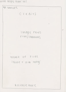
Initial designs for prom mo poster number two:


For my second initial design of the poster i decided to make the image the main focus of the background as this is very common with all film posters and conforms with the conventions. Rather than the credits being at the bottom of the poster i have decided to arrange them at the top of the poster, so film poster do this as they have big star names in them and this appeals to an audience as they will be known for good acting skills and thus providing good movies. The age certificate will be displayed in the top left hand corner, this shows the age of the audience allowed to view the film and indicates who the film is aimed at.

Initial designs for pro mo magazine number one:


My first initial design for my pro mo magazine, just like the film poster, will have an entire image as its background. This is due to research of other film magazines, they tend to have the most important story line as the background image which is usually from an upcoming film that their audience's are excited about. This will attract the viewing audience as they like to see new film releases and to read about them, it will help them to decide weather to view the film and will make it known to thousands of teenagers who read film magazines making it popular. We will be including typical features of a magazine such as a bar code, strap line, pug, cover lines and potential smaller images, this depends on weather it looks right when editing as we don't want to take the focus of the film we are trying to sell. By including typical features of a film magazine we are drawing in the correct audience that we want to see our film. The most important cover lines will be on the left hand third as this corresponds to the layout of shelving in a shop.

Initial designs for pro mo magazine number two:


My second design is slightly different from the first as the main cover line will be the only one on the left hand third, this does conform to the typical style of film magazines with the other cover lines being on the right hand side. There is no strap line on this design as not all magazines have them and are not essential unless the magazine wants to give a way a deal or make something else important stand out. The masthead will cover the entire width of the page, again this will vary on the title of the magazine and font size.

Analysis of exsisting media for two film magazines

Analysis of film magazine for Empire

Analysis of Existing Film Magazines No 1

Analysis of film magazine for Total Film

Analysis of Existing Film Magazine No 2

Analysis of exsisting media for three film posters

Analysis of a film poster for Paranormal Activity 2

Analysis of Existing Film Posters No 1

Analysis of a film poster for After.Life

Analysis of Existing Film Posters No 2

Analysis of a film poster for Twilight Eclipse:

Analysis of Existing Film Posters No3

Wednesday, 17 November 2010

Pro mo pictures


This is one of the photos we took for the magazine front cover, although we wont be using this one as the female protagonists eyes are slightly closed and the standing position of the obsessed male is awkward and not frightening to the audience. Whereas in the picture we have used, the standing position of the male character is scarier to the reader.


The picture above was taken for the use of the promotional poster, it will be darkened down in adobe photo shop to create a better atmosphere that relates to a horror trailer. All the characters appearing in the trailer are in the photograph letting the target audience know who is starring.


This is one of the photos we took for our promotional poster after we had been filming, this photo is landscape and therefore can not be used for our poster as we are creating it as a portrait size poster.

Sunday, 7 November 2010

Final Movie Trailer

Above is our final horror trailer, Obsession, we have used many different shots and locations within the trailer as to not lose the audiences attention. The first shot is of the company's name which is a a priority for the company to advertise what films they make. The trailer opens with an establishing shot, we chose this as to set the location and the actions of packing up a car connote that they are going somewhere together as a group. The following shot shows the characters traveling to the main location of the trailer, my favourite shot is of the males eyes in the interior mirror as he is looking at grace who is sat directly in the middle of the car so the audience know the focus is on these two protagonists. The next shot is a pan from the car to a sign that reads 'strictly no exit' indicating that perhaps they cannot leave and that danger is upon them, interesting the audience further. A high angled shot that pans up of all the characters is shown, this not only sets the new location but indicates that it is a dangerous situation as it is getting late in a woods. A cross dissolve into the next shot shows them camping, and yet another shot of grace and Jon are shown talking together, again reinforcing the idea to the audience that they are the main characters. A shot reverse shot of Jon and Grace having a conversation suggest to the reader that Grace is rejecting him once he has admitted he likes her, the music begins to change telling the audience something is changing, an over the shoulder shot is shown next of Jon watching Grace walk away, in which we get a sense that Jon becomes the villain in the trailer. A fading shot is shown signifying that time has passed, the shot of two other female characters is shown, this shot indicates the turning point in the trailer where something has gone wrong. The dialogue has unanswered questions making the target audience want to see it to find out. A quick flash of Jon's eyes is shown which is in time with the crash in the music, this was achieved with the razor tool in premier pro to spilt the shot and add a fade to white transition. A slide with a caption on appears reveling the words 'who can you really trust?' as this is shown just after Jon's eyes it indicates that he is the antagonist and is the reason for the disappearance of them both. The music changes once again and increases in tempo, shots of grace alone in the woods are shown, a jump cut is use so we get closer to her as if someone is following her (point of view shot), it makes her seem alone and lost from the group. As grace turns her head to face the camera there is a crash in the music, this is a very effective shot as we see the shock on her face and the audience sympathise with her. A much faster paced piece of music is introduced showing the last few shots. Conforming to freytags pyramid this sequence of shots is the falling action, a much faster pace of editing is used, by doing this is shows that the film entails loads of action shots widening the audience that would view the film. The blood on Graces face, once the editing has slowed down, shows someone has been hurt which is common in a horror trailer. The film name then appears which is an obvious piece of footage to include as it is a main convention of a film trailer. The final shot of the dropping of the knife with the sound reinforces that someone has killed someone else, this will interest the audience as they want to know who killed who. All the captions throughout the trailer help the audience understand what is going on better, the production name at the start and the cast names at the end of the trailer all add to making a professional feel to the trailer which we intended to achieve and fits the typical conventions of a horror trailer.

Issues with filming

One of the main problems we had when it came to filming the trailer was getting the characters needed in the trailer to be at the same place on the same day. Many of are characters were either busy with work or school commitments on the day that we needed to film, to sove this we had to make sure what days and times everyone was free and we settled on 2 full filming days and an extra day incase we needed to re shoot any shots or add in any more scenes. Another difficulty we came across was the lighting, most horror trailers are set at night therefore the lighing is obviously dark, if we had to film at a different time to the previous filming day the lighting would be different, we solved this by editing the lighting on Adobe premier pro it helped us to make the trailer link together as it would look wrong if one shot was light and went straight to dark when there was no lead up to the different light changes. Apart from these two issues our filming went very well and we managed to avoid the bad weather at this time of year.

Re-shoot/Re-Edit

When cominng to the final stages of the completion of of horror trailer we relised we needed a dark and intense shot of the main male character to heighten the obessive stoyline. This was easy arranged by booking the camera and deciding the day the male character was free to film different angled shots of him. We also needed to re film the scene of the concerned friends, the first shot of this had diaglogue in the background meaning the main speech of that shot could not be heard. We got over this dilema by deciding to re shoot the scene, again we booked the camera and selcting the characters we needed making sure they wore the same clothes as they had previously worn on the film shooting day.

Editing Process


This is a screen shot of Adobe Premier Pro where after every filming session, we uploaded the footage filmed to this software. Once the footage had been uploaded we dragged the shots we liked into the editing/work area which is shown in the screen shot with each individual green box, we then editing each individual shot to the standard we wanted, this ment changing effects such as lighting and speed as well as cutting the shots to shorten the clip. To use this effects we had to select them from the toolbars and drop down menus on the left hand side on the screen shot above. The most frequent effect that our group used was the brightning and contrast list as it was difficult to film at the exact same time on our filming days and at this time of year it gets darker earlier as the weeks go on, changing the lighting in each individual shot. By using this tool it allowed the trailer to look more fluent and that time hadnt gone forward or backwards unless we wanted it to appear like this. Also we felt that by darkening down shots it gave of the dramactic and eerie effect that are generally found in horror trailers. After we had edited the first few shots and had filmed the majority of our trailer, we started to put our shots in order of how we wanted the to appear, we did this by refering to our detailed storyboards and planning stages and ordered them according what our group thought best suited our storyline. The detail shot list that was created helped our group when filming as we could refer to it for help if we got stuck. By following our detailed storyboards and shot lists it made sure that we had filmed everything that we needed and wanted to be in our finished trailer. Once we had put our shots in order via the shot list and had done the majority of editing apart from the falling action where we needed to do fast paced editing and music, we uploaded our soundtrack. Next we began adding in still title slides that displayed captions to help the target audience follow the storyline, this also heightens the atmosphere we were trying to create. Once we had our basic trailer with the shots in order with captions in the correct place we began to watch our trailer through and see what improvements needed to be made. When we uploaded the song we knew if was over 3 minutes which exceded out trailer length and so we cut it right down to around one minute 30 seconds. To do this we used the Razor tool on the right hand side of premier pro and marked out the sections we needed to cut out. This was a very difficult and time consuming process as we needed to match the previous piece of music cut with the next. This needed to be perfect so that the audience would assume the song was fluent and sounded correct when played to our trailer. Although this was frustrating and errors were made at times we learnt how to better our new skill and edited our song to how we wanted it to sound. We then began to move our shots to fit the track. We left a couple of gaps in our trailer where we needed to film a few more shots when begining to finish our trailer, we new we had to film these it was just a matter of arranging time for the protaginist to act for us. Once we had filmed these final shots it was easy to slot this in to place, and adding our last affects to these final shots. The last few days of editing our trailer were very stressfull as we had to completly re edit our sound track as the tempo rose to earlier in our trailer according to our shot layout. To overcome this issue we repeated the first part of the soundtrack at the begining of the trailer which was the rising action, this alllowed the pace to increase at the correct point in the trailer. By having to repeat the track this again ment we had to arrange our shots correctly so it fitted the trailer, it also ment that we had to add sections of the song into the layer 'Audio 3' so that the song didnt have any gaps. This completed the editing of our horror film trailer.

Audience Feedback

I have put questions on my blog by using the poll tool, this was to help me find out what our target audience like and if they agree with the ideas we have come up with. The majority that took the poll agreed that they wanted to see music that was slow that builds up to get faster, we thought that this would work and by also anayalysing film trailers this was the most common music and relates to Freytag's pyramid. We asked the target audience for their opinion on potential film magazine names, Our group prefered 'The Cut' as it linked to a movie and also the editing of a movie making it clever and interesting. The poll results show that the audience prefered this name which made our group much more confident in using it. We also asked what they would like to see or what they expect in a horror trailer, the results showed that alot of people prefered to see a chase scene as well as a murder scene so we hope to encouperate both these ideas as well as our own into the trailer.

Detailed Storyboard

Our group put together all of our individual ideas and included the ones we thought worked best and well together. We have written and drawn in detail what is to be filmed and at what locations as well as certain shots that could potentially be used in our horror trailer. This will help us when we come to film our trailer as we can refer to which shots we have left to film, also when editing we can use it to help us have an idea of what order the sequence should be in, if any alterations need to be made this can be done on premier pro or we can re shoot a shot if we need to and then re edit our trailer.


Monday, 25 October 2010

Filming Locations

We are using a range of locations for our trailer to keep to the audicene interested as well as looking realistic as a film wouldnt use for example a single shot of a location throughout the whole of the film. Our main location is set in the woods where the most action and chase scenes will occur. By setting our main location in the woods the audience will associate this with a horror trailer as this type of location is used frequently in these genre films. As our trailer is based around a camping trip we will be using specific props within our trailer again making our trailer believeable to the viewing target audience. Below are the some of the locations that i have taken pictures of, that will feature in our final trailer.


Sunday, 17 October 2010

Target Audience

Our target audience are people who enjoy horror movies in general but also are interested in other film genres. People who are interested in our type of film trailer will be students varying from 16 to 25 and are in the working class sector. Our trailer is aimed at both females and males and this will be shown clearly in our trailer which will include both genders. This will be shown in our trailer through the characters clothing, the background music and the general mise en scene. To make our trailer stand out from other horror films we are using various locations with different angled shots and lighting which can also be edited on the editing software. In horror trailer and films the characters tend to wear dark clothing to emphasise the scary Ora, we will be incorporating this in our film trailer so the audience can recognise the genre along with the dramatic background music. Our group will eventually take out a questionnaire to our target audience to see what they think of our video and possible what they would like to see in a music video and if they think there could be any improvements, will we take these suggestions and apply them to our video to appeal even more to are target audience.

Saturday, 16 October 2010

Filming and Pro Mo Schedule

As you can see, here is a time table of when we can film our video. Me and my group spoke to the main characters and extras and discussed what days/nights we would be able to shoot the video. We also had to book the camera so we made sure we had a timetable to show when we would prefer to have the camera. We plan to film most of the video in the week commencing 18th of october, during this week we hope to take the promo package pictures. Then we hope to begin editing the trailer and therefore if we need to reshoot we have plenty of time before the deadline date. Although the times are a rough outline, it shows our group what time to meet so we have all the characters together. We have to make sure we have a range of shots and that they are well focused, by begining filming at this stage it allows us to correct any bad shots we come across.


Monday, 27 September 2010

OK GO! "This to shall past" and "White Knuckle"

This music trailer appears to be one long unbroken shot (like the famous scene from good fellows), However they use several effects to edit the video. A sequence of connective trials leading up to them getting splattered with paint. Similar to their oringinal video "here we go again" which consists of the same one set location making it incredibly cheap to make, the band also appears in their video which is a very common trait. Although it is cheap to create this video because if the one set location, their videos are highly effective, oringinal therefore making it unique and very memorable.

OK GO also all feaure in their music video white knuckle which they filmed in one take. The video feature "friends" which are highly trained dogs and are extremly well encorperarted into the music video. All of OK GO's music videos have wild ideas making them completly different from any other artist. Their most famous video that started this trend was "here it goes again" where the main focus is on them using tredmills and creating an amazing effect with them.

"White Knuckles"