Friday, 19 November 2010
Re-shoot/Re-Edit
Final Designs

Some changes have been made to our magazine cover due to audience feedback and this will be discussed above.
Final Film Poster

For our film poster we have featured all of the cast that appear in our trailer, also this particular shot was filmed for use in the trailer so the audience can make a link with it. The long shot image features a spotlight on the two main characters who walk in the middle of the cast, this makes it apparent who the film focuses on. The dark edging of the poster makes the image the the main focus, the image lighting was changed using the brightness and contrast tool in photo shop to give it a look of a horror movie poster. Again the location used here in a woods features in the film also suggesting to the audience that this is where the main location of the trailer is set. The characters appear to be walking into the unknown and do not know what will happen at this location giving the audience a feel for what is to come. The font style of the film name is of the same style featured in our trailer allowing the audience to make a connection between them both. The release date is displayed at the bottom of the poster as is a quote from a magazine, website address and a star rating. These are all conventions of current film posters, we also added that the film can be viewed in Imax 3d as this is very much the present and future of filming making it very popular viewing. Using white text similar to our magazine cover, stands out of the deep black background, this is so it is very clear to read and understand. The last feature that we added was our film companies name, which also features in our trailer. Again this is a popular convention used in film posters.
Pro Mo editing process
Stage one

For the first stage of our pro mo work for a music magazine we uploaded the picture into adobe photo shop and began darkening down the left hand side of the image. This was so the male protagonist was slightly hidden and was hard to make out his facial feature leaving the reader in suspense. We brightened up the female protagonist (the victim) to make her seem innocent and make her seem vulnerable intriguing the audience. We had decided on the name of the magazine which was 'The Cut' this was because we felt it would attract our target audience in the sense it was a strong, sharp name with a double meaning. It relates to film as our films are cut when making and editing them also it could be referring to the storyline of the new film release enticing the audience to view it to see what the outcome is. The dark clothing and posture of the characters also amplifies vunerable and scary atmosphere of the cover. To darken down the left hand third of the cover we used the burn tool and selected the areas we wanted to have darker. With the help of photoshop we lightened the face of the victim to highlight her worried expression.
Stage 2

Once the image had been darkened down we could decide on our cover line positions, the left hand third of the magazine is typically where the most important cover lines are put this is due to the layout of shelving in shops. We have also added in a bar code as this is an obvious feature on anything that is to be sold in a shop, the website and information about the magazine is under the masthead again this is typical of magazines and presents a professional feel to the target audience. A pug has been used in the top right hand side, by having a different colour text and background colour it draws the readers eye to something excited such as a freebie.
The exact same editing skills were carried out for the creation of the final film poster, using a different image of the protagonists in the trailer.
initial designs

I placed the name of the film at the top of the poster to draw the readers eye to the name of the film before anything else. This will make the name of the film memorable in the audiences mind and remind them to view the film. The whole of the poster will be an image of the protagonist which will be taken when we are filming our trailer, this allows the costumes, hair and make up to be the exact same giving of the professional feel to the poster. There will be a review of the film below the characters heads in the photos, influencing the viewing audience to find out if it is as good as the review says. It again attracts the target audience as a bad review puts audiences off watching a new release of a film. Another important factor of a film poster is the release date, this will be displayed under the review of the film, the release date will tell the audience when it will be released in cinemas and lets the audience know in advance when to view it. The image will be the main focus and therefore needs to be taken at a good angle with the correct style of lighting to make it stand out and look appealing.
Initial designs for prom mo poster number two:
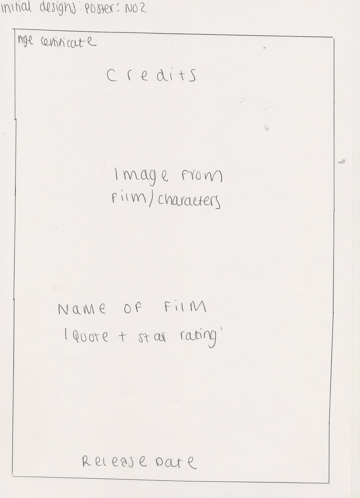
For my second initial design of the poster i decided to make the image the main focus of the background as this is very common with all film posters and conforms with the conventions. Rather than the credits being at the bottom of the poster i have decided to arrange them at the top of the poster, so film poster do this as they have big star names in them and this appeals to an audience as they will be known for good acting skills and thus providing good movies. The age certificate will be displayed in the top left hand corner, this shows the age of the audience allowed to view the film and indicates who the film is aimed at.
Initial designs for pro mo magazine number one:

My first initial design for my pro mo magazine, just like the film poster, will have an entire image as its background. This is due to research of other film magazines, they tend to have the most important story line as the background image which is usually from an upcoming film that their audience's are excited about. This will attract the viewing audience as they like to see new film releases and to read about them, it will help them to decide weather to view the film and will make it known to thousands of teenagers who read film magazines making it popular. We will be including typical features of a magazine such as a bar code, strap line, pug, cover lines and potential smaller images, this depends on weather it looks right when editing as we don't want to take the focus of the film we are trying to sell. By including typical features of a film magazine we are drawing in the correct audience that we want to see our film. The most important cover lines will be on the left hand third as this corresponds to the layout of shelving in a shop.
Initial designs for pro mo magazine number two:

My second design is slightly different from the first as the main cover line will be the only one on the left hand third, this does conform to the typical style of film magazines with the other cover lines being on the right hand side. There is no strap line on this design as not all magazines have them and are not essential unless the magazine wants to give a way a deal or make something else important stand out. The masthead will cover the entire width of the page, again this will vary on the title of the magazine and font size.
Analysis of exsisting media for two film magazines
Analysis of Existing Film Magazines No 1
Analysis of film magazine for Total Film
Analysis of Existing Film Magazine No 2
Analysis of exsisting media for three film posters
Analysis of Existing Film Posters No 1
Analysis of a film poster for After.Life
Analysis of Existing Film Posters No 2
Analysis of a film poster for Twilight Eclipse:
Analysis of Existing Film Posters No3
Wednesday, 17 November 2010
Pro mo pictures


Sunday, 7 November 2010
Final Movie Trailer
Above is our final horror trailer, Obsession, we have used many different shots and locations within the trailer as to not lose the audiences attention. The first shot is of the company's name which is a a priority for the company to advertise what films they make. The trailer opens with an establishing shot, we chose this as to set the location and the actions of packing up a car connote that they are going somewhere together as a group. The following shot shows the characters traveling to the main location of the trailer, my favourite shot is of the males eyes in the interior mirror as he is looking at grace who is sat directly in the middle of the car so the audience know the focus is on these two protagonists. The next shot is a pan from the car to a sign that reads 'strictly no exit' indicating that perhaps they cannot leave and that danger is upon them, interesting the audience further. A high angled shot that pans up of all the characters is shown, this not only sets the new location but indicates that it is a dangerous situation as it is getting late in a woods. A cross dissolve into the next shot shows them camping, and yet another shot of grace and Jon are shown talking together, again reinforcing the idea to the audience that they are the main characters. A shot reverse shot of Jon and Grace having a conversation suggest to the reader that Grace is rejecting him once he has admitted he likes her, the music begins to change telling the audience something is changing, an over the shoulder shot is shown next of Jon watching Grace walk away, in which we get a sense that Jon becomes the villain in the trailer. A fading shot is shown signifying that time has passed, the shot of two other female characters is shown, this shot indicates the turning point in the trailer where something has gone wrong. The dialogue has unanswered questions making the target audience want to see it to find out. A quick flash of Jon's eyes is shown which is in time with the crash in the music, this was achieved with the razor tool in premier pro to spilt the shot and add a fade to white transition. A slide with a caption on appears reveling the words 'who can you really trust?' as this is shown just after Jon's eyes it indicates that he is the antagonist and is the reason for the disappearance of them both. The music changes once again and increases in tempo, shots of grace alone in the woods are shown, a jump cut is use so we get closer to her as if someone is following her (point of view shot), it makes her seem alone and lost from the group. As grace turns her head to face the camera there is a crash in the music, this is a very effective shot as we see the shock on her face and the audience sympathise with her. A much faster paced piece of music is introduced showing the last few shots. Conforming to freytags pyramid this sequence of shots is the falling action, a much faster pace of editing is used, by doing this is shows that the film entails loads of action shots widening the audience that would view the film. The blood on Graces face, once the editing has slowed down, shows someone has been hurt which is common in a horror trailer. The film name then appears which is an obvious piece of footage to include as it is a main convention of a film trailer. The final shot of the dropping of the knife with the sound reinforces that someone has killed someone else, this will interest the audience as they want to know who killed who. All the captions throughout the trailer help the audience understand what is going on better, the production name at the start and the cast names at the end of the trailer all add to making a professional feel to the trailer which we intended to achieve and fits the typical conventions of a horror trailer.
Issues with filming
Re-shoot/Re-Edit
Editing Process

Audience Feedback
Detailed Storyboard

