
I placed the name of the film at the top of the poster to draw the readers eye to the name of the film before anything else. This will make the name of the film memorable in the audiences mind and remind them to view the film. The whole of the poster will be an image of the protagonist which will be taken when we are filming our trailer, this allows the costumes, hair and make up to be the exact same giving of the professional feel to the poster. There will be a review of the film below the characters heads in the photos, influencing the viewing audience to find out if it is as good as the review says. It again attracts the target audience as a bad review puts audiences off watching a new release of a film. Another important factor of a film poster is the release date, this will be displayed under the review of the film, the release date will tell the audience when it will be released in cinemas and lets the audience know in advance when to view it. The image will be the main focus and therefore needs to be taken at a good angle with the correct style of lighting to make it stand out and look appealing.
Initial designs for prom mo poster number two:
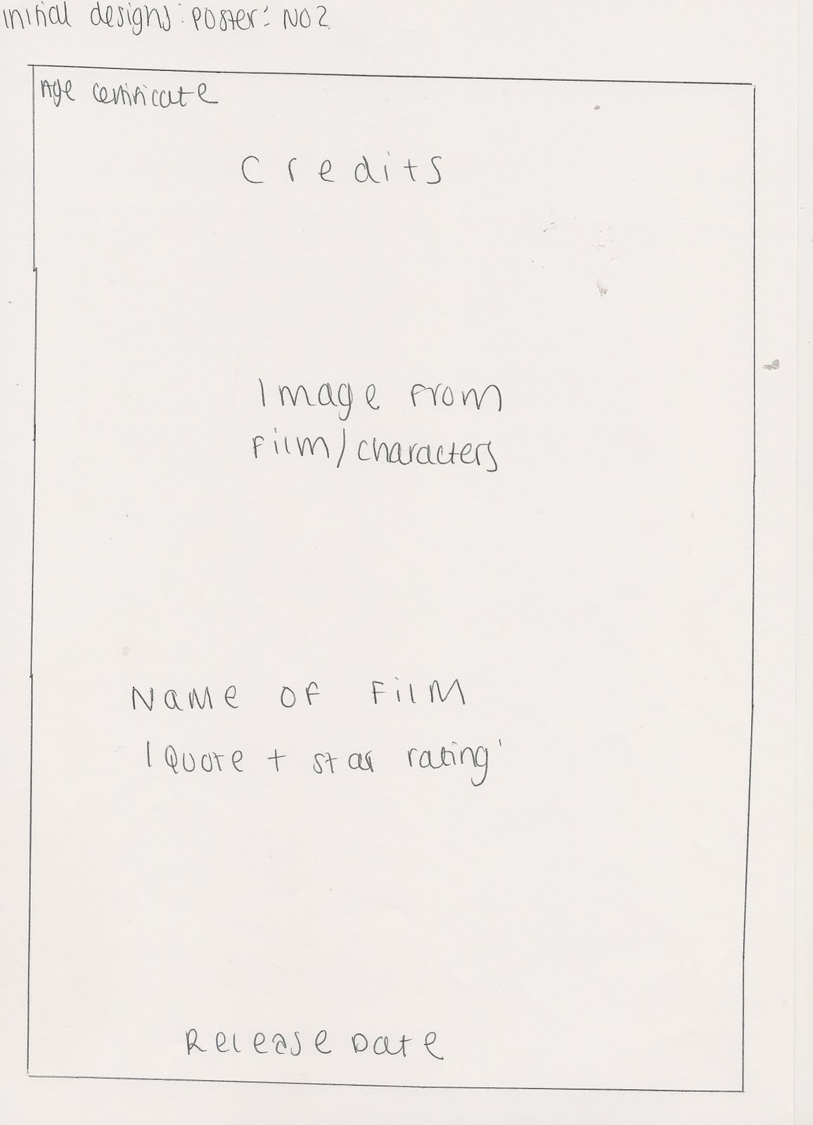
For my second initial design of the poster i decided to make the image the main focus of the background as this is very common with all film posters and conforms with the conventions. Rather than the credits being at the bottom of the poster i have decided to arrange them at the top of the poster, so film poster do this as they have big star names in them and this appeals to an audience as they will be known for good acting skills and thus providing good movies. The age certificate will be displayed in the top left hand corner, this shows the age of the audience allowed to view the film and indicates who the film is aimed at.
Initial designs for pro mo magazine number one:

My first initial design for my pro mo magazine, just like the film poster, will have an entire image as its background. This is due to research of other film magazines, they tend to have the most important story line as the background image which is usually from an upcoming film that their audience's are excited about. This will attract the viewing audience as they like to see new film releases and to read about them, it will help them to decide weather to view the film and will make it known to thousands of teenagers who read film magazines making it popular. We will be including typical features of a magazine such as a bar code, strap line, pug, cover lines and potential smaller images, this depends on weather it looks right when editing as we don't want to take the focus of the film we are trying to sell. By including typical features of a film magazine we are drawing in the correct audience that we want to see our film. The most important cover lines will be on the left hand third as this corresponds to the layout of shelving in a shop.
Initial designs for pro mo magazine number two:

My second design is slightly different from the first as the main cover line will be the only one on the left hand third, this does conform to the typical style of film magazines with the other cover lines being on the right hand side. There is no strap line on this design as not all magazines have them and are not essential unless the magazine wants to give a way a deal or make something else important stand out. The masthead will cover the entire width of the page, again this will vary on the title of the magazine and font size.
No comments:
Post a Comment